Hi, what do you want to do?
Curated Video
Describing Data Distributions from Graphed Data
Describe a data distribution from a graph (spread direction, shape symmetric and gaps).
NASA
NASA | SDO's Instruments: EVE
Dean Pesnell, the SDO Project Scientist, explains how the the Extreme Ultraviolet Variability Experiment (EVE) instrument will allow us to better measure solar irradiance in extreme ultraviolet wavelengths. This type of irradiance,...
NASA
NASA’s New View of the Daily Cycle of Rain
The most detailed view of our daily weather has been created using NASA's newest extended precipitation record known as the Integrated Multi-satellitE Retrievals for GPM, or IMERG analysis.
The IMERG analysis...
The IMERG analysis...
Curated Video
Describing Data Distributions from Graphed Data (Example)
Describe a data distribution from a graph (spread direction, shape symmetric and gaps).
Curated Video
PMP Certification Training - Project Risk Management
This video explains project risk management.<br<br/>/>
This clip is from the chapter "Agile Considerations" of the series "PMP® Certification Training".This section explains Agile considerations.
This clip is from the chapter "Agile Considerations" of the series "PMP® Certification Training".This section explains Agile considerations.
Curated Video
Data Analytics using Python Visualizations - Yearplot and Calendarplot for Color-Scaled Trends
This video explains Yearplot and Calendarplot for color-scaled trends.
<
br/>
This clip is from the chapter "Advanced Visualizations Using Business Applications" of the series "Data Analytics Using Python Visualizations".This...
<
br/>
This clip is from the chapter "Advanced Visualizations Using Business Applications" of the series "Data Analytics Using Python Visualizations".This...
Curated Video
Absolute Deviation and Mean Absolute Deviation
Calculate absolute deviations and the mean absolute deviations of a data set.
Curated Video
Mean Absolute Deviation
Calculate absolute deviations and the mean absolute deviations of a data set.
Curated Video
Data Analytics using Python Visualizations - Creating Error Bars
This video explains creating error bars.
<
br/>
This clip is from the chapter "Matplotlib and Seaborn – Libraries and Techniques" of the series "Data Analytics Using Python Visualizations".This section introduces you to Matplotlib...
<
br/>
This clip is from the chapter "Matplotlib and Seaborn – Libraries and Techniques" of the series "Data Analytics Using Python Visualizations".This section introduces you to Matplotlib...
NASA
NASA | In The Zone
Earths oceans are wide reaching and teeming with life. One microscopic aquatic organism plays a major role in making life on Earth possible: phytoplankton. Under certain conditions, excessive phytoplankton growth can result in an area...
Curated Video
Comparing Variability: Medians and Interquartile Ranges
In this video, the teacher explains how to compare the variability in weights of professional baseball and soccer players using medians and interquartile ranges. They demonstrate that while baseball players are heavier on average, soccer...
Curated Video
Understanding Population and Parameter in Statistical Questions
In this lesson you will learn to determine the population and parameter by analyzing a statistical question.
Curated Video
Summarizing Data: Measures of Variability
In this video, the teacher explains how to find the average distance from each data point to the mean using the mean absolute deviation (MAD). The teacher demonstrates this concept using examples of dinner prices and emphasizes that...
Curated Video
Statistics and Statistical Questions
Define statistics and explore statistical questions.
Curated Video
Choosing the Best Measure of Center and Variability
In this video, the teacher explains how to choose the best measure of center and variability for a given set of data. They discuss the concepts of mean, median, mode, range, and interquartile range, and provide examples to illustrate...
Math Mammoth
Math Mammoth: How to Make a Histogram and Calculate the Bin Width
Explains how to make a histogram after grouping the data into 'bins.' Also looks at central tendency and variability. [8:10]
Khan Academy
Khan Academy: Statistical and Non Statistical Questions
Looks at the types of questions that statistics can address and explains how to tell the difference between a statistical and a non-statistical question. [7:50]
Imagine Learning Classroom
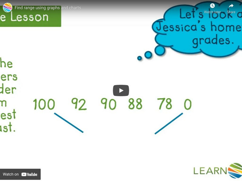
Learn Zillion: Find Range Using Graphs and Charts
In this lesson, you will learn to find the range of a given set of data including and excluding the outlier by using graphs and charts. Login gives access to a slideshow as well. [5:07]
Khan Academy
Khan Academy: Statistics: Variance of a Population
Video first reviews sample and population mean and their notation. Gives example of how variance is a useful description of a set and shows how to calculate variance including notation. Includes link to practice problems. [12:23]


