Hi, what do you want to do?
NASA
NASA in Silicon Valley: NASA in Silicon Valley Live - Halloween Costume and Cosplay Contest
In this episode streamed on Oct. 25, 2018, we host our first-ever NASA-themed Halloween costume and cosplay contest!
Curated Video
Choosing the Appropriate Graphical Representation for Data
In this video, the teacher explains how to choose the appropriate graph to represent data by analyzing its advantages and considering the specific data set. They discuss the advantages of dot plots, histograms, and box plots, and...
Curated Video
Comparing Data: Measures of Center and Spread
In this video, the teacher explains how to compare two sets of data using measures of center (median and mean) and measures of spread (standard deviation and IQR). The teacher emphasizes the importance of choosing the appropriate...
NASA
Goddard Space Flight Center Virtual Tour
NASA’s Goddard Space Flight Center in Greenbelt, Maryland, is one of the few space organizations that can manage a mission from beginning to end: imagine it, build it, test it, launch it and reap the scientific...
Curated Video
Checking for Independence: Analyzing Data in a Two-Way Table
In this video, the teacher explains how to use math to check whether two events are independent. Using the example of animal crackers, the teacher demonstrates how to analyze data in a two-way table to determine the independence between...
Curated Video
Analyzing Data and Drawing Inferences
In this video, students learn how to draw inferences by analyzing data. They are presented with statistics from a recent 5K race between the track team and the cross country team, and are guided through the process of interpreting the...
Curated Video
Analyzing Data: Comparing Sets with Outliers
In this video, the teacher explains how to compare two sets of data when there is an outlier. They discuss the use of measures of center and measures of spread, such as median and interquartile range, to analyze the data.
Curated Video
Drawing Inferences from Box Plots
In this video, the teacher explains how to draw inferences by analyzing data on a box plot. They review the different components of a box plot and how they can help make predictions about the data.
Curated Video
Making Inferences with Histograms in Basketball Analysis
This video uses the example of two basketball players to demonstrate how looking at multiple aspects of the data can lead to more informed inferences. By considering the players' scoring patterns and prior knowledge, we can predict who...
Curated Video
Analyzing Data on a Dot Plot
In this video, the teacher explains how to draw inferences by analyzing data on a dot plot. Using the example of two class periods' study times for a biology final, the teacher emphasizes the importance of considering multiple aspects of...
Visual Learning Systems
Observations and Data: Analyzing Data
One of the most important processes in science is the art of observing. This video highlights different ways observations are made, emphasizing methods by which students can observe their world. Different types of data, how data is...
Curated Video
Educators at the Massachusetts Institute of Technology decided to use a different approach to get kids interested in science. (May 8)
HEADLINE:MIT science festival focuses on kids
CAPTION: Educators at the Massachusetts Institute of Technology decided to use a different approach to get kids interested in science. (M
ay 8)
[Notes:Spark will be...
CAPTION: Educators at the Massachusetts Institute of Technology decided to use a different approach to get kids interested in science. (M
ay 8)
[Notes:Spark will be...
Annenberg Foundation
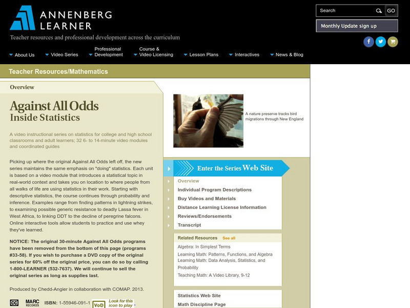
Annenberg Learner: Against All Odds: Multidimensional Data Analysis
A look at why multivariate data is collected and how it can be graphed by a computer program for study analysis. The real-life example shown here involves collecting and analyzing data taken from the Chesapeake Bay in order to examine...
Khan Academy
Khan Academy: Statistics: The Average
Introduction to descriptive statistics and central tendency. Gives demonstration of how to find arithmetic mean, median and mode of a set of numbers.
Sophia Learning
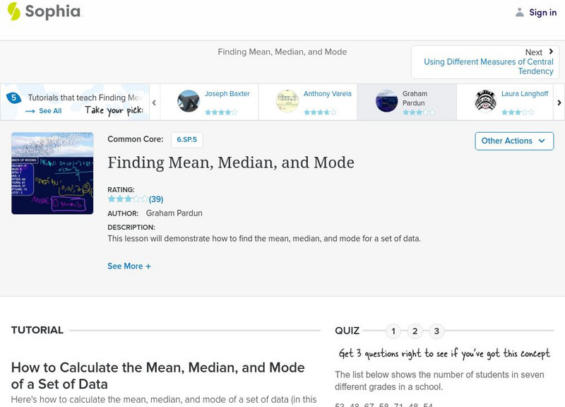
Sophia: Finding Mean, Median, and Mode
Solve for the mean, median, and mode when given a data set. Assess learning with a quiz.
Sophia Learning
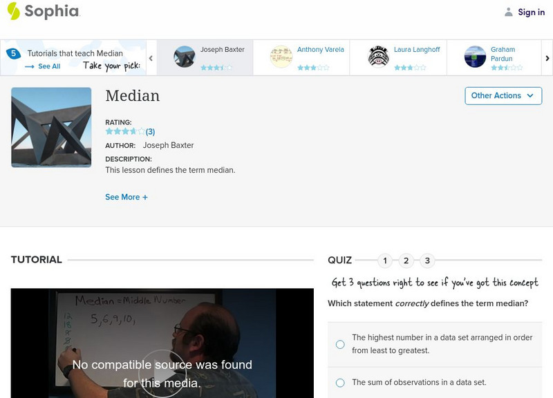
Sophia: Median Tutorial
Place data in numerical order to determine the median. Assessment to follow to determine understanding.
Sophia Learning
Sophia: Understanding Mean Tutorial
Explore how to find the mean, the average, of given data. Take a quiz to assess understanding.
Imagine Learning Classroom
Learn Zillion: Distinguish Between Measure of Center and Measure of Variance
In this video, you will learn the difference between measure of center and measure of variance by using a line plot and a number line to find the median and variance of a set of data. [3:43]
Imagine Learning Classroom
Learn Zillion: Find the Mean of a Data Set
In this lesson, you will learn how to describe the distribution of data by finding the mean. [4:43]
Imagine Learning Classroom
Learn Zillion: Use and Find the Range of a Data Set
In this lesson, you will learn how to describe the distribution of data by using the range. [4:30]
Loyola University Chicago
Math Flix: Statistics: Definitions and Review
This QuickTime movie provides a review of selected statistical definitions and applies them in an example. As you watch and listen to the teacher and student interact it helps clarify the thinking behind applying this concept.
PBS
Pbs Learning Media: The Voyage of Zheng He Ii
In this video segment adapted from 1421: The Year the Chinese Discovered America?, learn more about the theory that the Chinese discovered America prior to Columbus.
Khan Academy
Khan Academy: Biology Foundations: Data to Justify Experimental Claims Examples
Example questions analyzing data to justify claims in experiments. [5:27]
Khan Academy
Khan Academy: Center, Spread, and Shape of Distributions Harder Example
The resource from Khan Academy provides practice questions for the SAT. Watch Sal work through a harder Center, spread, and shape of distributions problem.


