Hi, what do you want to do?
University of North Carolina
Figures and Charts
Sometimes words aren't the best way to get information across to the reader. The eighth handout in the 24-part Writing the Paper series describes different type of figures and charts to display complex information in a paper....
Biology in Motion
Evolution Lab
Evolution occurs though change over time, but can it go any faster? Scholars speed up the process of evolution and observe a simulation of 20 blue organisms fighting for survival. A graph displays the changes in phenotype over time. By...
ProCon
School Uniforms
Americans spend around one billion dollars each year on school uniforms, but are they necessary? As pupils research the debate topic, they form their own opinions. They review the history of school uniforms and discover the top pro and...
US Environmental Protection Agency
Epa: Air Data
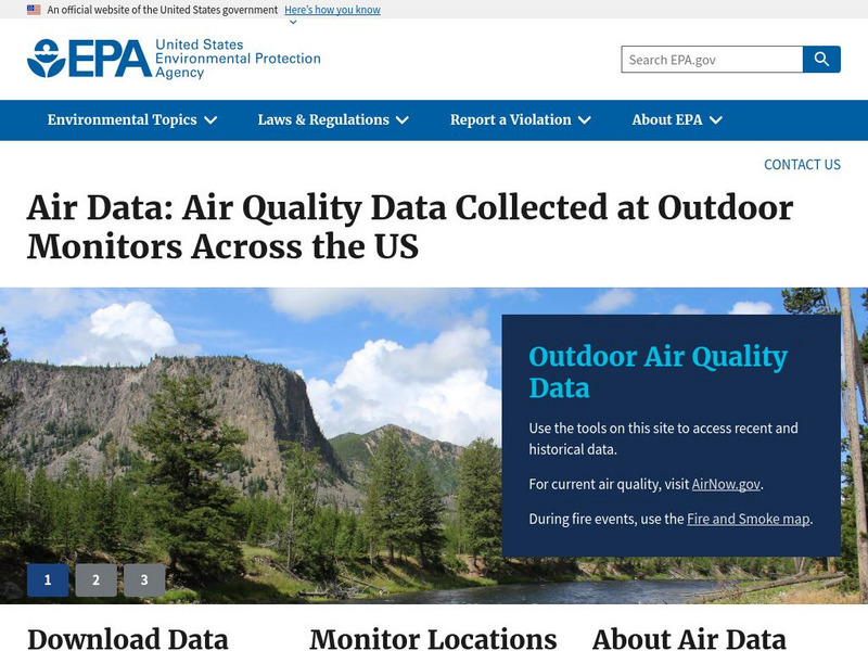
The AirData website gives you access to air quality data collected at outdoor monitors across the United States, Puerto Rico, and the U. S. Virgin Islands. The data comes primarily from the AQS (Air Quality System) database. You can...
University of Illinois
University of Illinois: Ncaa Basketball Finals Bar Graphs
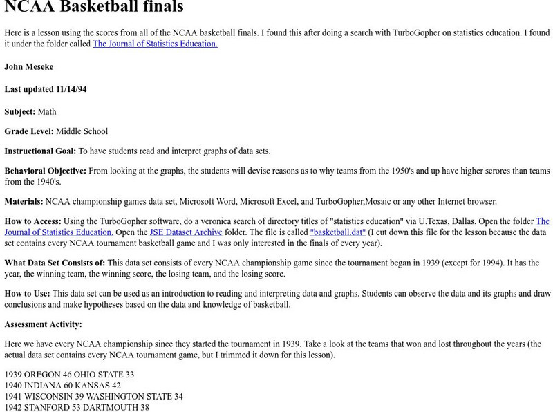
Site from University of Illinois contains a lesson plan that utilizes the NCAA Basketball Final Scores from 1939-1994. Students are instructed to analyze and interpret data displayed in bar graphs.
Incorporated Research Institutions for Seismology
Iris: J Ama Seis
jAmaSeis facilitates the study of seismological concepts in middle school through introductory undergraduate classrooms. Users can obtain and display seismic data in real-time from either a local instrument or from remote stations.
University of Illinois
University of Illinois: Earthquakes of the World
Resource contains a lesson plan that utilizes data from earthquakes. Students are instructed to analyze and interpret line graphs that display the earthquake data.
University of Illinois
University of Illinois: Rollin' Rollin' Rollin'
This resource is the beginning of a series of pages that demonstrates the diffference between the mean and median of a group of numbers. Uses bar graphs to display the data.
University of Illinois
University of Illinois: Rollin' Rollin' Rollin'
This page from the University of Illinois is the beginning of a series that demonstrates the difference between the mean and median of a group of numbers. The sites use bar graphs to display the data.


