Hi, what do you want to do?
University of North Carolina
Figures and Charts
Sometimes words aren't the best way to get information across to the reader. The eighth handout in the 24-part Writing the Paper series describes different type of figures and charts to display complex information in a paper....
Biology in Motion
Evolution Lab
Evolution occurs though change over time, but can it go any faster? Scholars speed up the process of evolution and observe a simulation of 20 blue organisms fighting for survival. A graph displays the changes in phenotype over time. By...
US Census Bureau
Us Census Bureau: International Data Base
Statistical data on the population and demographics of 228 countries, including change, sex ratios, life expectancy, and percent with HIV/AIDS. There are also detailed explanations of the means of producing these statistics. It is...
BSCS Science Learning
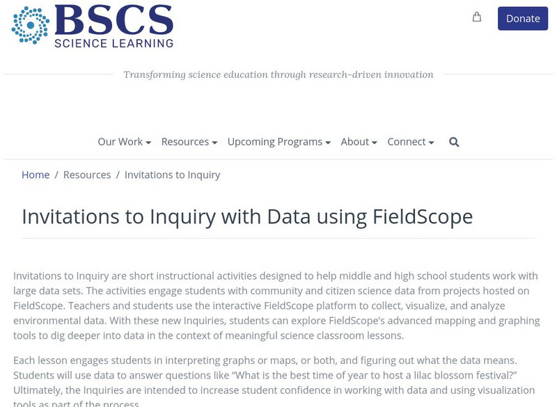
Bscs: Invitations to Inquiry With Data Using Field Scope
Invitations to Inquiry are short instructional activities designed to help middle and high school students work with large data sets. Teachers and students use the interactive FieldScope platform to collect, visualize, and analyze...
Other
Honolulu Hi 5: Cool Maps With Awesome Weather Data Across 1,219 Us Cities
Explore the weather in states and cities across the United States. Two maps with accompanying graphs are provided. The first indicates the number of comfortably warm summer days a place has and the second shows the temperature and how...
University of Auckland School of Computer Science
Morris: Graphs
A description of the graph data structure and how it is used to solve certain types of problems.
NOAA
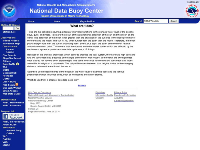
Noaa: National Data Buoy Center: What Are Tides?
A very general introduction to tides and their cycles, with one link to a graph of tide data.
Center for Innovation in Engineering and Science Education, Stevens Institute of Technology
Ciese Collaborative Projects: Down the Drain: How Much Water Do You Use?
How much water do you use everyday? Find out in this engaging investigation, where you compare your water usage with your classmates and other people around the world. An exploration filled with lots of math and science that students are...
Wolfram Research
Wolfram Math World: World's Most Extensive Mathematics Resource
MathWorld provides a huge mathematics encyclopedia detailing the concepts of geometry, algebra, calculus, discrete math, number theory, and other math topics--complete with formulas, diagrams, examples, and references for thorough...
University of Illinois
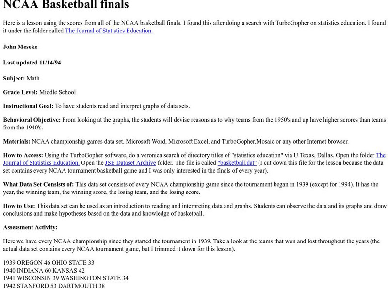
University of Illinois: Ncaa Basketball Finals Bar Graphs
Site from University of Illinois contains a lesson plan that utilizes the NCAA Basketball Final Scores from 1939-1994. Students are instructed to analyze and interpret data displayed in bar graphs.
PBS
Pbs Learning Media: A Flooding Threat
In this video segment from Cyberchase, the CyberSquad uses a graph to estimate how much the water level will rise in the Sensible Flats reservoir.
University Corporation for Atmospheric Research
Ucar: Atmospheric Science Explorers: Global Climate Change
A detailed overview of global climate change, with explanations of Earth's climate change, the carbon cycle, ecosystems, and greenhouse gases, and how the movements of matter and energy impact on climate. All information is reinforced...
Other
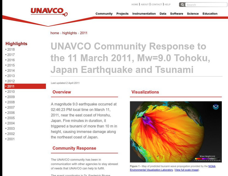
Unavco: Event Response to the Mw=9.0 Tohoku, Japan Earthquake and Tsunami
Relevant data connected to the earthquake as well as links to technical information and science websites. Also find many graphs and charts with information on the tectonic activity.
US Department of Education
Helping Your Child Learn Math: Math in the Home
An excellent compilation of activities that engage parents and children in math explorations at home. Detailed lessons covering a wide range of math topics such as fractions, measurements, money, data collection, and math in newspapers....
Teachnology
Teachnology: Teacher Guide to Probability and Statistics
Statistics Theme provides a collection of free sample worksheets, teacher resources, lesson plans and interactive media for grades k-12.
PBS
Pbs Learning Media: Digit in Pursuit
The CyberSquad tracks Digit's position in time and then studies graphs to figure out what Hacker is scheming in this video from Cyberchase.
PBS
Pbs Learning Media: Raising the Bar
Harry and Bianca's new boss at a concession stand uses bar graphs to keep records of their refreshment sales in this video from Cyberchase.
Other
The Silver Institute: Silver Production
This page gives detailed information about world silver production. Contains graphs and charts of the production of various countries and top-producing companies.
University of Illinois
University of Illinois: Rollin' Rollin' Rollin'
This resource is the beginning of a series of pages that demonstrates the diffference between the mean and median of a group of numbers. Uses bar graphs to display the data.
NOAA
Noaa: Gulf Oil Spill Educational Resources
NOAA provides educational resources regarding the Gulf of Mexico oil spill such as imagery, animations, videos, lessons, activities, real world data, trajectory maps, and background information. Lessons such as Cleaning Oiled Feathers...
Can Teach
Can Teach: Math Centers
This page offers a variety of math center ideas for general math and geometry. Instructions on setting up the center are not provided for most ideas, however, those lacking instructions are pretty self-evident.
Population Connection
Population Connection
Population Connection, a grassroots organization concerned about overpopulation and its affect on the quality of life, provides a wealth of materials about human population. Resources include world population fact sheets, factoids,...
US Census Bureau
Uscb: Us Government: Us Census Bureau
Site provides census data for housing, population data, people, and much more.
Other
Oecd: Implementing the Oecd Jobs Strategy [Pdf]
"Implementing the OECD Jobs Strategy Lessons from Member Countries' Experience," from The Organization for Economic Co-operation and Development, 1996. This is an in-depth site which contains lots of graphs and charts showing...


