Crash Course
Charts Are Like Pasta - Data Visualization Part 1 - Crash Course Statistics
Today we're going to start our two-part unit on data visualization. Up to this point we've discussed raw data - which are just numbers - but usually it's much more useful to represent this information with charts and graphs. There are...
Curated Video
Understanding Pie Charts: Visualizing Data with Jacket Sizes for Girls Basketball Teams
New ReviewThis video provides a clear and detailed explanation of how to create a pie chart using basic statistical concepts. The example used is of a head coach at a school planning jacket sizes for the girls' basketball teams. The coach...
Curated Video
Don’t Make These Overall Trend Mistakes on IELTS - IELTS Energy Podcast 1298
Today you'll learn about the two biggest mistakes students make when they write overall trends in their task 1 essays. Find out the highest-scoring, and fastest, way to create this necessary sentence.
FuseSchool
What Is Nuclear Fission?
"How does a nuclear reactor provide energy? What causes a nuclear meltdown? And how do we make this safe?
Curated Video
KS2 Primary Maths Age 9-13 - Statistics: Pie Charts - Explained
SchoolOnline's Primary Maths videos are brilliant, bite-size tutorial videos delivered by examiners. Ideal for ages 9-13, they cover every key topic and sub topic covered in Maths in clear and easy to follow steps. This video looks at...
Curated Video
REST API Automation Testing from Scratch - REST Assured Java - Generating Excellent Cucumber HTML Reporting with Additional Plugins
This video explains how to generate excellent Cucumber HTML reporting with additional plugins. This clip is from the chapter "Cucumber BDD API Framework Development from Scratch - 1" of the series "REST API Automation Testing from...
Curated Video
GCSE Secondary Maths Age 13-17 - Probability & Statistics: Pie Charts - Explained
SchoolOnline's Secondary Maths videos are brilliant, bite-size tutorial videos delivered by examiners. Ideal for ages 13-17, they cover every key topic and sub topic covered in GCSE Maths in clear and easy to follow steps. This video...
Let's Tute
Microsoft Excel Tutorial: Understanding Pie Charts and their Types
This video tutorial teaches how to create and use five different types of pie charts in Microsoft Excel to present data in a visual and easy-to-understand way. The tutorial covers how to create pie charts, change chart types, and use...
Bloomberg
China, Carbon and the Future of Global Trade
Tom Orlik, Chief Economist, Bloomberg Economics discusses the impact of carbon on global trade.
Scholastic
Study Jams! Circle Graph
Over a pizza dinner, RJ and Mia discuss how to use a circle or pie graph to represent data. After viewing, data analysts can use a Test Yourself feature to assess their own understanding. This is ideal for use in a flipped classroom lesson.
Corbett Maths
Interpreting Pie Charts
Not pi, but pie! A video instructor explains how to read and interpret a pie chart. The lesson shows the best way to identify the part of the population in each section of the pie using fractions and/or percents.
Corbett Maths
Drawing a Pie Chart
Easy as pie ... with a little work anyway! A complete lesson provides video instruction on creating a pie chart from a set of data. The practice that follows helps learners draw their own pie charts while practicing skills from the...
Crash Course
Charts Are Like Pasta - Data Visualization Part 1: Crash Course Statistics #5
Clever marketers can use visual statistics to mislead their target populations. Explore these visual misrepresentations with a video lesson from a larger statistics playlist. The lesson instructor explains visual representations of both...
Mathed Up!
Pie Charts
Representing data is as easy as pie. Class members construct pie charts given a frequency table. Individuals then determine the size of the angles needed for each sector and interpret the size of sectors within the context of frequency....
Bozeman Science
Beginner's Guide to Graphing Data
A graph is a graph is a graph. This video reviews different types of graphs (line, bar, circle, histogram, scatter plot) using a matching game. It also describes the purpose of each type of graph to help learners remember when to use...
Sophia Learning
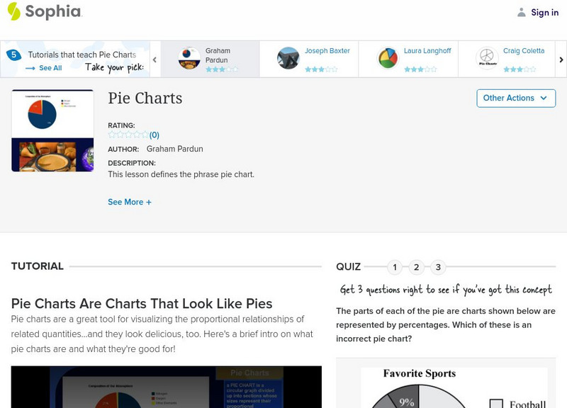
Sophia: Pie Charts
Explore how data is represented on a pie chart and how to interpret the data. Take a quiz to assess learning.
Sophia Learning
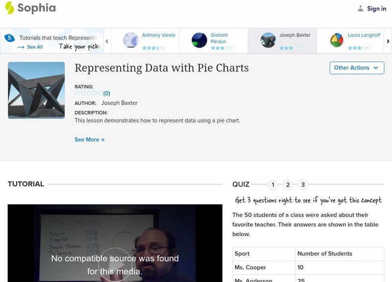
Sophia: Representing Data With Pie Charts
Explore how to use data to create a pie chart and take a quiz to assess learning.
Loyola University Chicago
Math Flix: Graphs: Reading Circle Graphs
This QuickTime movie provides an opportunity to practice reading circle graphs. A pdf worksheet is available by clicking on the hyperlink at the bottom of the page. As you watch and listen to the teacher and student interact it helps...


