Curated OER
Creating Line Graphs
Young scholars relate data to coordinate graphs and plot points on this graph. They use minimum wage data to construct the graph. Students decide appropriate time intervals for the graphs. They share graphs with their classmates.
Curated OER
Geologic cross section of Manhattan, NYC
Learners draw an accurate geologic cross section by using a given data table. They relate the features of the cross section to geologic processes. Students then relate the characteristics of the bedrock to the architecture.
Willow Tree
Histograms and Venn Diagrams
There are many different options for graphing data, which can be overwhelming even for experienced mathematcians. This time, the focus is on histograms and Venn diagrams that highlight the frequency of a range of data and overlap of...
Curated OER
Communication Delay
Construct a maze in your classroom and have a blindfolded scientist act as a space rover, maneuvering unfamiliar terrain while another scientist plays commander. Classmates record the number of occurrences of the commander having to...
Curated OER
Carbon 14 Dating, Variation 2
Your archaeologists begin this task with a table of values to estimate the time passed based on the half-life of Carbon 14 remaining in a plant. They then move on to find when a specific amount of Carbon 14 is present in the same plant,...
Curated OER
A Speeding Rocket, a Shooting Star... It's a Racing Reader!
Prepare a gameboard and die-cut race cars to play a fun fluency game. Also create several flash cards to review the long /i/ sound. Then, model reading smoothly and with expression, emphasizing the importance of re-reading...
Curated OER
# 21 Measuring Nitrate by Cadmium Reduction
Students design an experiment to evaluate the effects of various treatments on the nitrogen cycle in a freshwater aquarium. They are required to maintain a laboratory notebook of all work, measure the key analytes of the biosystem at...
Illustrative Mathematics
Velocity vs. Distance
At the end of this activity, your number crunchers will have a better understanding as to how to describe graphs of velocity versus time and distance versus time. It is easy for learners to misinterpret graphs of velocity, so have them...
Statistics Education Web
What Does the Normal Distribution Sound Like?
Groups collect data describing the number of times a bag of microwave popcorn pops at given intervals. Participants discover that the data fits a normal curve and answer questions based on the distribution of this data.
EngageNY
Two Graphing Stories
Can you graph your story? Keep your classes interested by challenging them to graph a scenario and interpret the meaning of an intersection. Be sure they paty attention to the detail of a graph, including intercepts, slope,...
University of Colorado
Planetary Distances on the Playground
Earth is 149,600,000 km, or 92,957,130.4 miles, from the sun. Young astronauts create an interactive model to learn the distances between planets. Nine groups, each representing a different planet, are spread around at class-calculated...
Curated OER
In the Billions and Exponential Modeling
Modeling population growth gives learners an opportunity to experiment with real data. Comparing the growth rates in this real-life task strengthens learners' understanding that exponential functions change by equal factors over equal...
LABScI
Kinematics: The Gravity Lab
Falling objects can be brutal if you don't protect your noodle! Scholars explore the motion of falling objects through measuring short intervals to determine if the distance traveled varies with time. Building off of this, scholars...
EngageNY
Margin of Error When Estimating a Population Mean (part 1)
We know that sample data varies — it's time to quantify that variability! After calculating a sample mean, pupils calculate the margin of error. They repeat the process with a greater number of sample means and compare the results.
EngageNY
Graphs of Simple Nonlinear Functions
Time to move on to nonlinear functions. Scholars create input/output tables and use these to graph simple nonlinear functions. They calculate rates of change to distinguish between linear and nonlinear functions.
EngageNY
Square Roots
Investigate the relationship between irrational roots and a number line with a resource that asks learners to put together a number line using radical intervals rather than integers. A great progression, they build on their understanding...
EngageNY
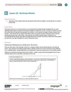
Nonlinear Motion
Investigate nonlinear motion through an analysis using the Pythagorean Theorem. Pupils combine their algebraic and geometric skills in the 24th lesson of this 25-part module. Using the Pythagorean Theorem, scholars collect data on the...
Virginia Department of Education
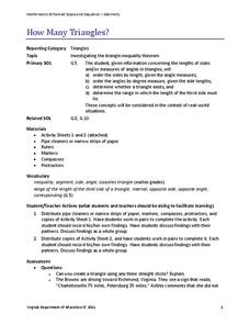
How Many Triangles?
Something for young mathematicians to remember: the sum of any two sides must be greater than the third. Class members investigates the Triangle Inequality Theorem to find the relationship between the sides of a triangle. At the...
NASA
Foam Rocket
When going for distance, does it make a difference at what angle you launch the rocket? Teams of three launch foam rockets, varying the launch angle and determining how far they flew. After conducting the series of flights three times,...
Curated OER
Timing the Transit of Venus
Middle schoolers calculate elapsed time and look for patterns.
Curated OER
Our Hour
First graders keep track of time throughout the day by recording the time and what activity they are doing at that particular hour. They keep both analog and digital time.
Curated OER
The Space Between
Students explore major, minor and perfect intervals and watch the PowerPoint presentation "The Space Between." They identify the various intervals by sight and differentiate major, minor and perfect intervals. Students perform the...
Curated OER
Topographic Map Unit Plan
Learners examine topographic maps and discover how to decipher contour intervals, use contour lines and apply information to complete a topographic map lab. Working in groups, they identify the scale of the map, latitude and longitude,...
Curated OER
Weaving Weather Maps with the World Wide Web
Students access the Internet and use real time data from the American Meteorological Society to create a detailed weather map. They make weather predictions based on the data collected.

